Learn the basics of data analysis and visualisation using Python with Pandas, Matplotlib and Seaborn libraries!
Recently I was tutoring a student to help them with their data science coursework within their business degree, and I thought it would be useful to share some of the lessons here. As an example, we’ll be using supermarket sales data (modified from Kaggle) and cover the basics of data preprocessing and data analysis with Python and Pandas, and data visualisation with Matplotlib and Seaborn. By the end of the post you should know how to load and filter your data and do some basic statistics and visualisations with it.
Data Preprocessing with Pandas
Let’s start by importing the Pandas and Matplotlib libraries:
import pandas as pd
import matplotlib.pyplot as plt
Next, we import the datasets into Pandas dataframes using the Pandas read_csv() function:
df_sales = pd.read_csv('supermarket_sales_data.csv')
df_product = pd.read_csv('supermarket_product_data.csv')
Now let’s visualise the first few rows from each dataset using a dataset’s head() function, to get an idea of data in each dataset:
df_sales.head()| Invoice ID | Branch | City | Customer type | Gender | Tax 5% | Total | Date | Time | Payment | cogs | gross margin percentage | gross income | Rating | |
|---|---|---|---|---|---|---|---|---|---|---|---|---|---|---|
| 0 | 750-67-8428 | A | Yangon | Member | Female | 26.1415 | 548.9715 | 1/5/2019 | 13:08 | Ewallet | 522.83 | 4.761905 | 26.1415 | 9.1 |
| 1 | 226-31-3081 | C | Naypyitaw | Normal | Female | 3.8200 | 80.2200 | 3/8/2019 | 10:29 | Cash | 76.40 | 4.761905 | 3.8200 | 9.6 |
| 2 | 631-41-3108 | A | Yangon | Normal | Male | 16.2155 | 340.5255 | 3/3/2019 | 13:23 | Credit card | 324.31 | 4.761905 | 16.2155 | 7.4 |
| 3 | 123-19-1176 | A | Yangon | Member | Male | 23.2880 | 489.0480 | 1/27/2019 | 20:33 | Ewallet | 465.76 | 4.761905 | 23.2880 | 8.4 |
| 4 | 373-73-7910 | A | Yangon | Normal | Male | 30.2085 | 634.3785 | 2/8/2019 | 10:37 | Ewallet | 604.17 | 4.761905 | 30.2085 | 5.3 |
df_product.head()| Invoice ID | Product line | Unit price | Quantity | |
|---|---|---|---|---|
| 0 | 750-67-8428 | Health and beauty | 74.69 | 7.0 |
| 1 | 226-31-3081 | Electronic accessories | 15.28 | 5.0 |
| 2 | 631-41-3108 | Home and lifestyle | 46.33 | 7.0 |
| 3 | 123-19-1176 | Health and beauty | 58.22 | 8.0 |
| 4 | 373-73-7910 | Sports and travel | 86.31 | 7.0 |
Because both datasets contain different information about each transaction, let’s merge them into a single dataset by the Invoice ID using the Pandas merge() function:
df = pd.merge(df_sales, df_product, on='Invoice ID')We can now display the columns of this merged dataset using a dataframe’s info() function, and we can see that the product and the sales columns have now been combined:
df.info()<class 'pandas.core.frame.DataFrame'>
Int64Index: 1000 entries, 0 to 999
Data columns (total 17 columns):
# Column Non-Null Count Dtype
--- ------ -------------- -----
0 Invoice ID 1000 non-null object
1 Branch 1000 non-null object
2 City 1000 non-null object
3 Customer type 1000 non-null object
4 Gender 1000 non-null object
5 Tax 5% 1000 non-null float64
6 Total 1000 non-null float64
7 Date 1000 non-null object
8 Time 1000 non-null object
9 Payment 1000 non-null object
10 cogs 1000 non-null float64
11 gross margin percentage 1000 non-null float64
12 gross income 1000 non-null float64
13 Rating 1000 non-null float64
14 Product line 1000 non-null object
15 Unit price 950 non-null float64
16 Quantity 975 non-null float64
dtypes: float64(8), object(9)
memory usage: 140.6+ KBHowever, if we now look at the Non-Null Count results in the info() output, we can see that Unit price and Quantity columns each have a rows with missing data (50 and 25 rows respectively). To handle missing data, one option is simply to delete all the rows that contain any missing data using the dropna() function:
df = df.dropna()If we now show the dataset info, we can see that all columns have the same number (950) of non-null rows:
df.info()<class 'pandas.core.frame.DataFrame'>
Int64Index: 950 entries, 0 to 999
Data columns (total 17 columns):
# Column Non-Null Count Dtype
--- ------ -------------- -----
0 Invoice ID 950 non-null object
1 Branch 950 non-null object
2 City 950 non-null object
3 Customer type 950 non-null object
4 Gender 950 non-null object
5 Tax 5% 950 non-null float64
6 Total 950 non-null float64
7 Date 950 non-null object
8 Time 950 non-null object
9 Payment 950 non-null object
10 cogs 950 non-null float64
11 gross margin percentage 950 non-null float64
12 gross income 950 non-null float64
13 Rating 950 non-null float64
14 Product line 950 non-null object
15 Unit price 950 non-null float64
16 Quantity 950 non-null float64
dtypes: float64(8), object(9)
memory usage: 133.6+ KBIf we want to keep the rows containing missing data, another option is also to replace the missing data with statistic such as the column mean using the fillna() function:
df['Unit price'].fillna(df['Unit price'].mean(), inplace=True)
df['Quantity'].fillna(df['Quantity'].mean(), inplace=True)
Displaying the dataset info now shows that we kept all 1000 rows and now there are no missing data:
df.info()<class 'pandas.core.frame.DataFrame'>
Int64Index: 1000 entries, 0 to 999
Data columns (total 17 columns):
# Column Non-Null Count Dtype
--- ------ -------------- -----
0 Invoice ID 1000 non-null object
1 Branch 1000 non-null object
2 City 1000 non-null object
3 Customer type 1000 non-null object
4 Gender 1000 non-null object
5 Tax 5% 1000 non-null float64
6 Total 1000 non-null float64
7 Date 1000 non-null object
8 Time 1000 non-null object
9 Payment 1000 non-null object
10 cogs 1000 non-null float64
11 gross margin percentage 1000 non-null float64
12 gross income 1000 non-null float64
13 Rating 1000 non-null float64
14 Product line 1000 non-null object
15 Unit price 1000 non-null float64
16 Quantity 1000 non-null float64
dtypes: float64(8), object(9)
memory usage: 140.6+ KBNext, the dataset may contain outliers, that is data points that are very far from the typical samples from the data distribution (for example, arising from mistakes when manually logging the data). To visualise these we can use a box plot for the relevant column, in this case Quantity:
plt.boxplot(df['Quantity'])
plt.title('Box Plot of Quantity')
plt.ylabel('Quantity')
plt.grid(True)
plt.show()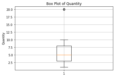
A box plot visualises the data’s median (orange line), the 25th and 75th percentiles (edges of the box) and each quartile plus or minus 1.5 times the interquartile range (IQR, the “whiskers”). Any data points that are outside of the whiskers are visualised by circles and denote the outliers — in this case there are some outliers around Quantity=20. We can get the values of the outliers using the loc() function where we select all rows of the Quantity column where the points are outside of the 1.5 * IQR range:
Q1 = df['Quantity'].quantile(0.25)
Q3 = df['Quantity'].quantile(0.75)
IQR = Q3 - Q1
outliers = ((df['Quantity'] < (Q1 - 1.5 * IQR)) | (df['Quantity'] > (Q3 + 1.5 * IQR)))
df.loc[outliers, 'Quantity']
93 20.0
100 20.0
562 20.0
692 20.0
729 20.0
Name: Quantity, dtype: float64In this case we have 5 outliers that are all 20. Now we again have a few options how to handle outliers — one is simply to delete all the corresponding rows:
df = df[~outliers]Another option is to cap the value of the outliers to some value such as the 99th percentile:
df.loc[outliers, 'Quantity'] = df['Quantity'].quantile(0.99)
df.loc[outliers, 'Quantity']
93 10.0
100 10.0
562 10.0
692 10.0
729 10.0
Name: Quantity, dtype: float64Data Analysis with Pandas
Now that we have preprocessed the data by merging the datasets and handing missing data and outliers, we are ready to do some data analysis. We can get basic statistics about the columns in the dataset by using the describe() function:
df.describe()| Tax 5% | Total | cogs | gross margin percentage | gross income | Rating | Unit price | Quantity | |
|---|---|---|---|---|---|---|---|---|
| count | 950.000000 | 950.000000 | 950.000000 | 9.500000e+02 | 950.000000 | 950.000000 | 950.000000 | 950.000000 |
| mean | 15.416576 | 323.748103 | 308.331526 | 4.761905e+00 | 15.416576 | 6.986421 | 56.130378 | 5.526316 |
| std | 11.769669 | 247.163048 | 235.393379 | 6.042795e-14 | 11.769669 | 1.711092 | 27.268558 | 2.926720 |
| min | 0.508500 | 10.678500 | 10.170000 | 4.761905e+00 | 0.508500 | 4.000000 | 10.080000 | 1.000000 |
| 25% | 5.789250 | 121.574250 | 115.785000 | 4.761905e+00 | 5.789250 | 5.600000 | 32.642500 | 3.000000 |
| 50% | 12.218750 | 256.593750 | 244.375000 | 4.761905e+00 | 12.218750 | 7.000000 | 55.620000 | 5.000000 |
| 75% | 22.687375 | 476.434875 | 453.747500 | 4.761905e+00 | 22.687375 | 8.500000 | 78.380000 | 8.000000 |
| max | 49.650000 | 1042.650000 | 993.000000 | 4.761905e+00 | 49.650000 | 10.000000 | 135.649819 | 10.000000 |
We can also get specific statistics like the mean, median and standard deviation for particular columns as:
print(df['Quantity'].mean())
print(df['Unit price'].median())
print(df['Total'].std())
5.526315789473684
55.620000000000005
247.1630476392563To compare different subgroups in the data, such as the mean values of each column for member and nonmember customers, we can use the groupby() function:
df.groupby('Customer type').mean()| Tax 5% | Total | cogs | gross margin percentage | gross income | Rating | Unit price | Quantity | |
|---|---|---|---|---|---|---|---|---|
| Customer type | ||||||||
| Member | 15.744493 | 330.634348 | 314.889855 | 4.761905 | 15.744493 | 6.955187 | 56.986513 | 5.603734 |
| Normal | 15.078850 | 316.655859 | 301.577009 | 4.761905 | 15.078850 | 7.018590 | 55.248632 | 5.446581 |
Or if we want to compare the sales across different supermarket branches, we can group the sum of Total by the Branch using subgroup as:
df.groupby('Branch')['Total'].sum()Branch
A 99478.3125
B 102748.3275
C 105334.0575
Name: Total, dtype: float64If we now want to count how many of each value a particular column has, such as how many sales there have been of each different product line, we can do this with the value_counts() function:
df['Product line'].value_counts()Fashion accessories 170
Food and beverages 169
Electronic accessories 159
Sports and travel 157
Home and lifestyle 152
Health and beauty 143
Name: Product line, dtype: int64To determine how different variables are related to each other we can print the correlation matrix for the dataset as:
df.corr()| Tax 5% | Total | cogs | gross margin percentage | gross income | Rating | Unit price | Quantity | |
|---|---|---|---|---|---|---|---|---|
| Tax 5% | 1.000000 | 1.000000 | 1.000000 | NaN | 1.000000 | -0.038968 | 0.631543 | 0.697840 |
| Total | 1.000000 | 1.000000 | 1.000000 | NaN | 1.000000 | -0.038968 | 0.631543 | 0.697840 |
| cogs | 1.000000 | 1.000000 | 1.000000 | NaN | 1.000000 | -0.038968 | 0.631543 | 0.697840 |
| gross margin percentage | NaN | NaN | NaN | NaN | NaN | NaN | NaN | NaN |
| gross income | 1.000000 | 1.000000 | 1.000000 | NaN | 1.000000 | -0.038968 | 0.631543 | 0.697840 |
| Rating | -0.038968 | -0.038968 | -0.038968 | NaN | -0.038968 | 1.000000 | -0.006769 | -0.023632 |
| Unit price | 0.631543 | 0.631543 | 0.631543 | NaN | 0.631543 | -0.006769 | 1.000000 | 0.042173 |
| Quantity | 0.697840 | 0.697840 | 0.697840 | NaN | 0.697840 | -0.023632 | 0.042173 | 1.000000 |
Data Visualisation with Matplotlib
Let’s now visualise our data using the Matplotlib library. Matplotlib can generate different types of plots, such as line plots for visualising continuous data, scatter plots for investigating the relationship between variables, bar charts for categorical variables, and pie charts for visualising proportions of data. Let’s say we first want to visualise the total sales as a function of time. We can do this by first converting the Date column of the dataset from a string into a Pandas datetime format and creating a new Month column containing the month of each sale. We can then display the sum total of the sales by month using the groupby() function as:
df['Date'] = pd.to_datetime(df['Date'])
df['Month'] = df['Date'].dt.month
monthly_sales = df.groupby('Month')['Total'].sum()
monthly_sales
Month
1 111017.1195
2 92414.6580
3 104128.9200
Name: Total, dtype: float64To visualise this, we first create a Matplotlib plot using the figure() function and then call the plot() function on the dataset column we want to visualise, in this case monthly_sales. We can then set the plot title, axis labels and show the grid. We can see that the sales drop slightly in February but recover by March:
plt.figure(figsize=(5, 3))
monthly_sales.plot(kind='line')
plt.title('Monthly Sales Trends')
plt.xlabel('Month')
plt.ylabel('Total Sales')
plt.grid(True)
plt.show()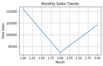
Let’s say we now want to compare the sum total of sales across different product lines. We can do that by first grouping the sum of the Total column by the product line, and then sorting the sales as:
sales_by_product_line = df.groupby('Product line')['Total'].sum().sort_values()
sales_by_product_line
Product line
Health and beauty 46398.5445
Electronic accessories 50201.9595
Home and lifestyle 50918.9520
Fashion accessories 52140.1020
Sports and travel 52874.6610
Food and beverages 55026.4785
Name: Total, dtype: float64We can now plot a bar chart visualising the sales for each category by calling the plot function on the previous data, now with the parameter ‘kind’ set to ‘bar’. We can rotate the x axis labels slightly and then compress the plot using the tight_layout() function:
plt.figure(figsize=(5, 3))
sales_by_product_line.plot(kind='bar')
plt.title('Sales by Product Line')
plt.xlabel('Product Line')
plt.ylabel('Total Sales')
plt.xticks(rotation=45)
plt.tight_layout()
plt.show()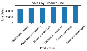
Let’s say we now wish to investigate if higher priced products generate more total sales. We can do that by using a scatter plot showing the total sales as a function of the unit price using the scatter_plot() function. In this case we can see that higher priced products lead to more total sales, as well as a few outliers where the unit price is higher than expected:
plt.figure(figsize=(5, 3))
plt.scatter(df['Unit price'], df['Total'], alpha=0.5, color='green')
plt.title('Relationship between Total Sales and Unit Price')
plt.xlabel('Unit Price')
plt.ylabel('Total Sales')
plt.grid(True)
plt.show()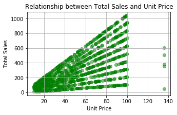
Finally, let’s say we are interested in comparing the sales for member and nonmember customers to evaluate the effectiveness of membership. We can do this by plotting a pie chart of the total sales grouped by the customer type as follows and see that member customers lead to more total sales than nonmembers:
customer_sales = df.groupby('Customer type')['Total'].sum()
plt.figure(figsize=(5, 3))
customer_sales.plot(kind='pie')
plt.title('Proportion of Sales by Customer Type')
plt.tight_layout()
plt.show()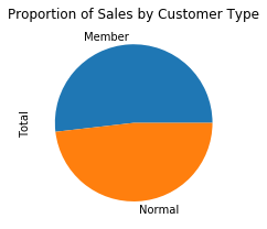
Advanced Visualisations with Seaborn
We can create more advanced and better looking plots of data with the Seaborn library that builds on top of Matplotlib. For example, we can create violin plots showing the density of a variable, pair plots showing the relationships between multiple variables, and heatmap plots for visualising correlations. Firstly, we can create a violin plot that visualises the distibutions of variables, in this case comparing the distributions of unit price across different branches:
plt.figure(figsize=(5, 3))
sns.violinplot(x='Branch', y='Unit price', data=df)
plt.title('Distribution of Unit Prices by Branch')
plt.xlabel('Branch')
plt.ylabel('Unit Price ($)')
plt.show()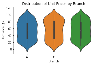
Next, if we want to investigate the relationships between multiple variables we can use the pair plot, in this case showing how unit price, quantity and total are related for different branches. We can see that higher unit prices and quantities lead to higher total sales.
sns.pairplot(df, hue='Branch', vars=['Unit price', 'Quantity', 'Total'])
plt.suptitle('Pairwise Relationships by Branch', y=1.02)
plt.show()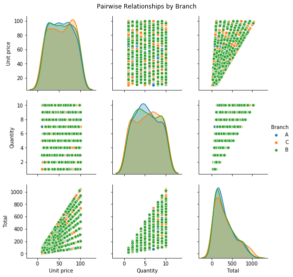
We can visualise 2-dimensional data using a heatmap plot, in this case visualising the correlation matrix between unit price, quantity and total:
corr = df[['Unit price', 'Quantity', 'Total']].corr()
plt.figure(figsize=(5, 4))
sns.heatmap(corr, annot=True, fmt=".2f", cmap='coolwarm', cbar=True)
plt.title('Correlation Matrix of Prices, Quantities, and Totals')
plt.show()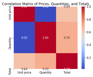
Finally, we can visualise a facet grid plot of some function of data for different values across the rows and columns of the plots. For example, here we visualise the histogram of total sales across different branches and payment methods:
g = sns.FacetGrid(df, col="Branch", row="Payment", margin_titles=True)
g.map(plt.hist, "Total", color="steelblue", bins=30)
g.set_axis_labels('Total', 'Frequency')
g.fig.suptitle('Total Sales Distribution by Branch and Payment Method', y=1.03)
plt.show()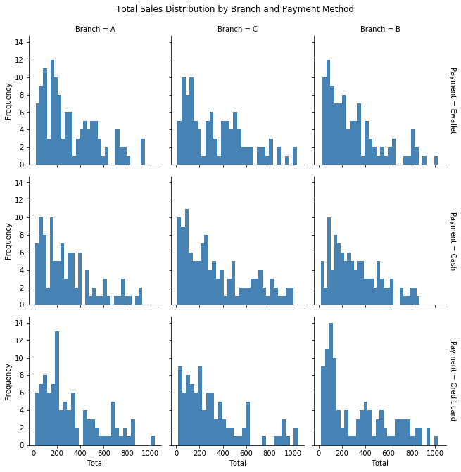
So there you have it, an introduction to data preprocessing, data analysis and data visualisation for business. There are a lot more topics I could cover, such as more advanced data filtering and analysis and more complex plots with Seaborn, but as this is an introduction I wanted to keep it short and self-contained. I hope this gives you an idea of how to get started with doing basic data science in business!

Leave a Reply