This summer I spent 9 weeks doing a research internship at Imperial College London’s Data Science Institute. Supervised by a finishing PhD student Axel and his postdoc colleague Miguel, I was working on a project which aims to identify fake news tweets based on their metadata. My work included data analysis, feature engineering, and tuning and evaluation of different machine learning models to obtain the best possible classifier to distinguish fake news from other types of news. I have mostly worked with Python and the Scikit-Learn machine learning library, but I have also briefly used parallel processing, the R language, and the TensorFlow library. I found the work really exciting and also a great learning experience. To learn more about the project and how to find an internship, read on!
Finding an internship
Finding good research opportunities is not very easy, especially if you want to do something interesting and want to do it at a good university or a company. The fact that I was a first year wasn’t ideal (companies would rather take finalists so that they can screen them for a possible job at their company), and the fact that I wanted to to software engineering or computing research while doing a physics undergraduate didn’t help either. I have applied to around 10 major software companies and emailed another around 10 academics from different universities about possible summer research in computing, but most I haven’t even heard from and those I did hear from contained mostly something on the lines “Thank you for your email and interest. I am afraid we are not looking for more interns at the moment.”, and so on, and so on. After a while I got so used to this that every time I sent an application or an email, I expected to get rejected by default.
However, all was not lost. After a while I have heard back from Metaswitch Networks, a software engineering company which has invited me for an interview — however, by the time I was free to do the interview after a few weeks, they have already filled the places (lesson: don’t postpone your interviews). I have also heard from Mathworks (the company which makes MatLab) and went through 2 phone interviews which seemed to go well but afterwards I haven’t received any decision from them so I just let it go (lesson: if you’re really interested in a company and they don’t reply maybe try emailing them to see how the decision went). However, I wasn’t that super excited about the work both of these companies were doing, and in this respect I would recommend rather applying for a small startup company or university research where you’re more likely to be given more interesting work to do.
Regarding research, the best strategy in the end turned out to be to physically come to your chosen professor’s office, slam your CV onto their desk and directly ask them if you can do a research placement with them. I found this to be the best way because once you enter their room they can’t simply ignore you just like they do with emails, so they have to listen to you. And once they’re listening, you two can talk about why you’re interested in this area, show them your relevant experience and talk about what possible research project might be possible to do. It also makes you stand out from all the rest of the applicants because by actually coming to their office it shows them you’re serious about the research unlike someone who just sends the same emails to every professor (ehm ehm don’t know who you’re talking about). Anyway, that’s how I got offers to do summer research in both robotics and machine learning at Imperial, of which I chose the machine learning research at the Data Science Institute (DSI).
Confused beginnings
The first approximately two weeks at the DSI were super hard and exhausting for me. On my first day at the DSI, my then supervisor gave me a paper to read about some cutting edge research on using reinforcement learning to learn running gaits of simulated robots and asked me to reproduce the paper’s results but instead of making the robot learn to run I was supposed to make it learn to dance (you can see the paper here). Having almost no previous knowledge of machine learning, I started reading the abstract and immediately realised I have no clue what the paper is talking about: “… We address the first challenge by using value functions to substantially reduce the variance of policy gradient estimates at the cost of some bias, with an exponentially-weighted estimator of the advantage function that is analogous to TD(λ) …” — what are value functions? policy gradient estimates? bias? exponentially-weighted estimator of the advantage function? TD(λ)? And that was just one sentence. That’s when I realised this was going to be hard.
That week I spent long hours at work trying to slowly decipher the meaning of these sentences and started studying some basic theory about reinforcement learning and machine learning in general. It was hard. But it was also very exciting — I have wanted to learn about machine learning for a long time now and this was the perfect opportunity.
After around a week and a half of studying reinforcement learning, a PhD student sitting next to me in the office approached me and asked if I would like to help him with his project which was about trying to distinguish fake news tweets from other types of tweets. That sounded very interesting and, considering my previous project was probably too difficult for a first-time machine learning project, I said yes. He suggested me to study Generative Adversarial Networks (GANs) while he prepared a data set of tweets which I was supposed to label later on. And so I went on to study GANs, a completely different concept to the reinforcement learning I was studying up until now.
GANs turned out to be a really cool method used for example to create computer-generated images which looked like real photos taken by humans — I was supposed to make it generate fake news tweets, by doing which the algorithm would learn what constitutes a fake tweet and be able to distinguish fake tweets from other tweets. And so I spent the next few days trying to understand a tutorial on using GANs to generate computer-generated images. Turned out the tutorial contained too many unfamiliar concepts and so I had to go back to the start again, this time studying the basics of supervised learning, then neural networks, convolutional neural nets (CNNs), and proceeding to more and more difficult topics until I finally understood how GANs work at which point I was able to understand the GAN tutorial. After I have implemented it and ran it, it felt great! The learning process was very exciting and also super efficient, since I started with basically zero knowledge and had to learn all these concepts on the way very fast. If you want to learn something fast, I would say the best way is to find an interesting project which uses the concepts that you want to learn and then try to do the project.
After a few days when I finally understood GANs and got the image-generating program running, my supervisor told me to actually focus on the fake news tweet project, which was when I found out that using GANs with text instead of images wasn’t currently possible. Ouch. So, having studied another topic for a while, I wasn’t going to use that one as well (the previous one being reinforcement learning). But it didn’t matter since all the things I learned on the way to understand GANs were very interesting and are also useful if I wanted to do machine learning with images. At that point my supervisor has finished preparing the tweet data set and told me it should take about 3 days to manually annotate the 4500 tweets, which we needed for all of the machine learning algorithms to learn from. Turned out 3 days wasn’t exactly the best estimate…
Annotating the dataset
This is where my work relevant to the fake news project actually began. Every supervised learning application requires an annotated dataset which contains a list of features and a corresponding label for the ML algorithm to learn from. In this case the features were the metadata about a particular tweet such as number of retweets, number of URLs included in the tweet, number of followers the posting user has, etc., and the labels were if the tweet was fake news or not. To obtain our dataset, my supervisor has used the Twitter API to pull a few hundred thousand tweets related to the 2016 US election into a MongoDB database and then used a Python script to filter them down to around 9000 by selecting only the ones which were viral (i.e. those with retweet count higher than 1000) and only those which were the original tweets (i.e. the dataset didn’t include retweets of a given viral tweet). Thus, we ended up with only original viral tweets about the US election, and these were likely to contain many instances of fake news as intended. Here’s how a subset of the tweets data looked like — each row corresponds to a different tweet and each column contains a different feature (metadata field).
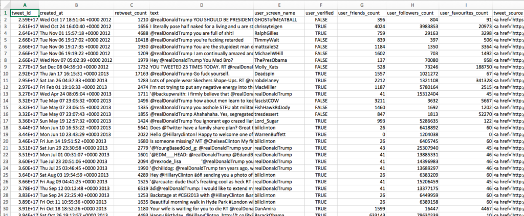
However, for a supervised machine learning model to learn from the data, we needed to manually annotate the tweets in the dataset as fake news or not or unknown (and if it is fake news, also choose which category of fake news it is). Given 9000 tweets, my supervisor has decided to give me 4500 tweets to annotate, which he said should take around 3 days of full work but turned out to be more like 2 weeks. Annotating them was not a trivial process — for each tweet I needed to read the content of the tweet (the text field), check the links to external websites or other tweets mentioned in the given tweet, and perhaps consider the username of the posting user. However, I often had to do further research on the content of a tweet to check if it isn’t made up and is in fact factually correct by reading around the topic of the tweet on external websites like PolitiFact or reliable news sources. Therefore, the process was very slow. The image below shows the types of labels we have used — first is_fake_news describes if the tweet is fake news or not and then category specifies a subcategory of fake (or real) news.

To give an example, the tweet with the content “Never underestimate the power of stupid people in large groups. #ElectionNight #USElection2016 #DonaldTrump” would be labeled as not fake news (is_fake_news=FALSE) and “cannot be classified” category (category=0) because it is not real news but just a comment or opinion. Another tweet, published by BBC breaking news with content “Donald Trump says it is time for Americans to ‘come together as one united people’ https://t.co/XrJNPXK7rp… https://t.co/rsSjazTdrn” would be classified again as not fake news (is_fake_news=FALSE) and subcategory of real news (category=-1). An example of fake news might be “.@DiamondandSilk still celebrating @realDonaldTrump Presidential Win by a landslide. ‘Party over here. Woot Woot.’… https://t.co/VVLBHfsDYE” — since Trump didn’t win by a landslide this would be categorized as fake news (is_fake_news=TRUE) of the fabricated type (category=1). Another example of fake news would be “Republicans control – Senate – House – Maj. of Governors – Supreme Court pick – Presidency This hasn’t happened since 1928 #ElectionNight“, which is false according to PolitiFact and would be classified as fake news (is_fake_news=TRUE) of category large-scale hoaxes (category=2). Although in my part of the research I have only used the broad category of whether the tweet is fake news or not (not the subcategories), the subcategories might be useful in later research for further analysis.
There were multiple people working on the tweet annotation including my supervisor, his colleagues and one other summer intern, and since it would have taken too long to wait for everyone to finish my supervisor has decided to give me his current portion of annotated tweets so that I would have at least something to work with. Eventually there would be two rounds of curation to resolve any conflicting labels for the tweets but to get started I have only used one of those two rounds since the labels were often present only for one of them (I have only used the labels obtained by my supervisor). Later on when all the tweets will be annotated it won’t be too hard to just change a portion of the code to include both rounds of labeling in the program in some way. So, now having around 6000 labeled tweets, I was ready to proceed to the data analysis stage of the research.
Data analysis and feature engineering
Time-related features
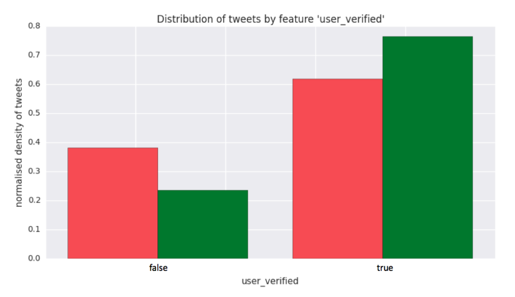
Having the annotated dataset, I was now ready to visualise and analyse the data. First, I have made a script (`stats_plots.py`) to plot all the discrete features on a histogram by their class, each showing the normalised density of tweets for each discrete value of the feature. For example for the feature user_verified whose value represents if the user posting the tweet has a verified account or not, the plot of normalised tweet density vs feature value is shown below. From this you can see that if the posting user is verified, the tweet is more likely to be “other news” (green bar) than “fake news” (red bar), and the converse if the user is not verified.
We’re using normalised density of tweets instead of using just tweet count because otherwise for every feature the probability of a tweet being fake news would always be significantly smaller than that the tweet being other type of news, which wouldn’t tell us much about how good the feature is. This is caused by the dataset being imbalanced (there are many more non-fake news tweets than fake news tweets), and so by using normalised density of tweets we’re able to see how good a feature would be as if we had the same proportion of fake news and other types of news.
This feature turns out to be one of the most important ones in the sense that it has a high ∆µ and low p-value. ∆µ is the difference in means between the ‘fake’ and ‘other’ class distributions after all the data points for this feature have been scaled to mean of zero and standard deviation of one (µ=0, σ=1). The scaling ensures that ∆µ’s across different features can be compared since they are the differences in means on the same scale (the z-scale). The p-value corresponds to a measure of confidence of how different the ‘fake’ and ‘other’ classes are according to a t-test — the smaller the value of p, the more confident we are that the result given by the t-test is statistically significant. Therefore, having big values of ∆µ allows the feature to differentiate the ‘fake’ and ‘other’ classes well and a low p-value ensures that the difference between the classes is also statistically significant. In this case ∆µ=-0.335 and p=4.3e-18, meaning that fake news has a mean that is 0.335 standard deviations below the mean of other types of news and the difference between fake news and other news as described by this feature is statistically significant (any p<0.01 is deemed significant enough).
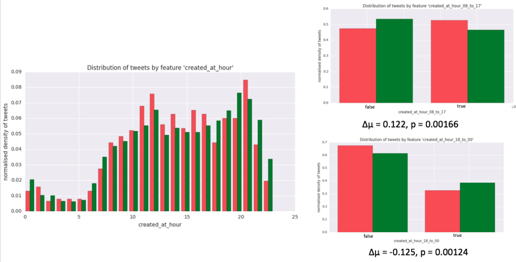
Another example of a discrete feature might be created_at_hour where I extract the hour at which the tweet was posted and convert it from UTC to EST time. One thing you can observe from the histogram is that people post more tweets during daytime hours as compared to night hours, which makes sense. Another thing you can notice is that there seem to be more other types of news being published between the hours of 18 and 00 and more fake news being published between the hours of 08 to 17. These might make for potentially good features (i.e. features which might distinguish fake and other news well) and so I have engineered two more derived features, one called created_at_hour_08_to_17 and another created_at_hour_18_to_00 which are binary and whose histograms show that if a tweet has been posted between 8am and 5pm the tweet is more likely to be fake news and if it has been posted between 6pm and 12am it is more likely to be other type of news. This result is not as significant as for the user_verified feature but it is not bad.
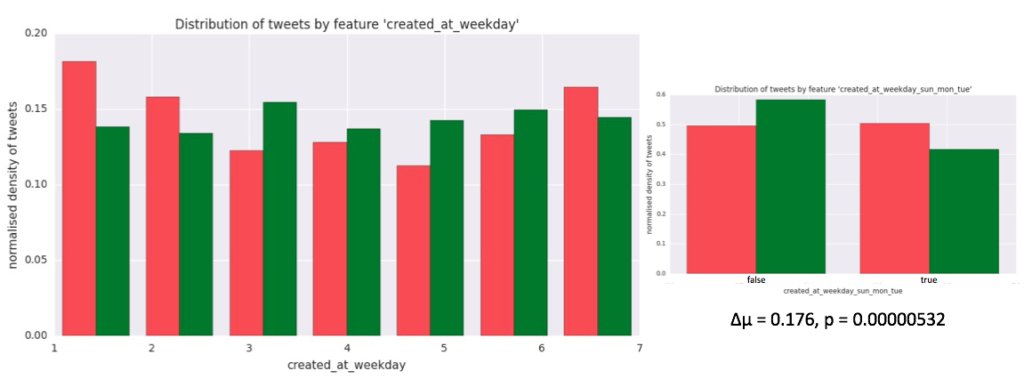
One more interesting feature I have engineered turned out to be created_at_weekday which extracts the (local EST) weekday when the tweet was published. It turned out that most fake news are published over Sunday, Monday and Tuesday, and so I made a corresponding binary feature created_at_weekday_sun_mon_tue which is true when the tweet was published during those days and false otherwise. It turns out that this feature is pretty good (it has a high ∆µ and low p-value).
I continued doing this for all the discrete features and plotted a graph of each one into the feature_plots folder (note that binary features have a numerical x-axis where 0 represents false and 1 represents true).
Per-unit-time related features
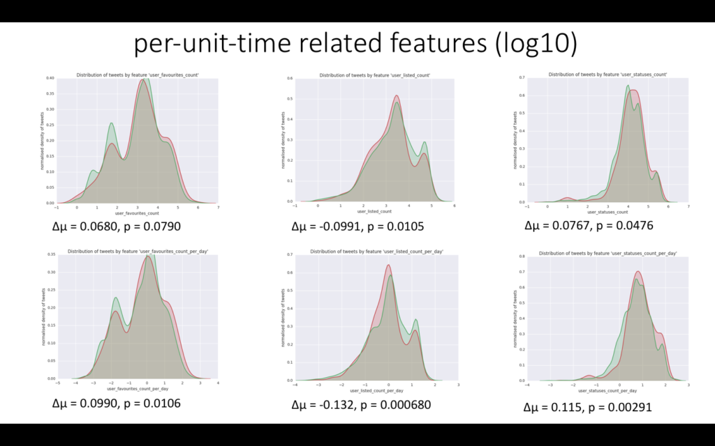
Some of the features in the dataset are also continuous, such as retweet_count which describes how many times a particular tweet was retweeted, user_followers_count which describes how many followers the posting user has, etc. Since the normalised tweet density might vary greatly with the feature value, I have plotted the densities using KDE plot (Kernel Density Estimation plot) which smoothes out the density curves. Also, since the values of these features span multiple orders of magnitude, the x-axis was logged (log10 of the feature value). You can see some of the continuous features below, each with a corresponding per-unit-time feature which was made by dividing the original feature by the number of days the tweet has been up (if the original feature is about the tweet) or divided by the number of days the user account has been up (if the original feature is about the user) — it’s best to see the graphs themselves for an example. Some interesting features turn out to be user_friends_count_per_day, user_followers_count_per_day, user_listed_count_per_day and user_statuses_count_per_day, each of which has a high ∆µ and low p-value. For example user_statuses_count_per_day gives the number of tweets the posting user publishes in one day, and this number turns out to be significantly different for fake news tweets and other types of tweets.
Text-related features
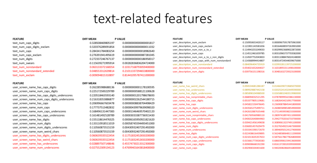
Although this project focuses primarily on classification of tweets based on their metadata as opposed to using natural language processing (NLP) on the tweet’s contents, I have engineered a few text-related features which do not analyse the meaning of the words in the text but instead focus on the “text metadata” related to the tweet’s contents, such as number of capital letters in the tweet’s content, whether the user screen name has digits, or the number of exclamation marks used in the user’s description. All of the text-related features are summarised in the image below. One of the best features turned out to be the combined number of capital letters and digits in the tweet’s content (with very high normalised difference in mean and extremely low p-value of ∆µ=0.329, p=1.8e-17) and whether the user screen name contains capital letters or digits (∆µ=0.262, p=1.18e-11). Features shown in black are statistically significant (p<0.01), features shown in red are not significant enough (p>0.05) and features shown in orange are possibly significant (0.01
All features
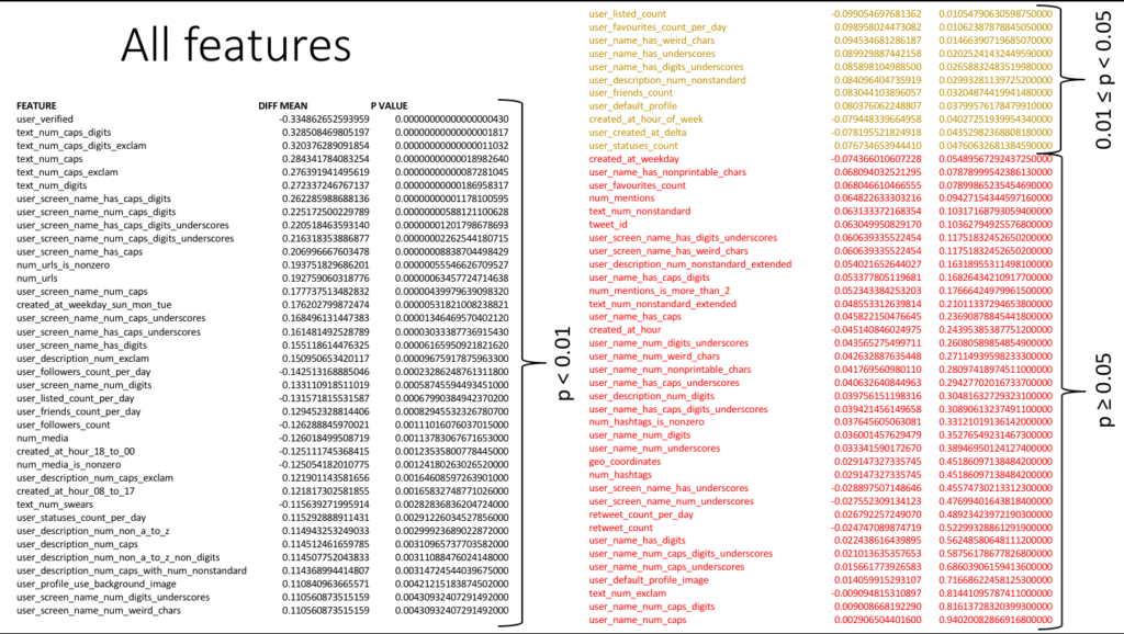
Finally, here is a summary of all the features together with their scaled difference in means (∆µ) and p-values. They are sorted by descending difference in means, which happens to be the same as sorting them by ascending p-values. Therefore, better features will come higher up in the list.
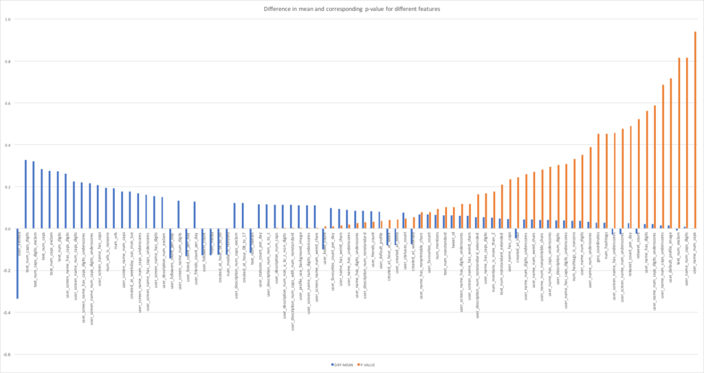
Also, plotting the difference in means and p-value on a histogram for each feature and sorting them by the difference in means produces the following graph.
Model evaluation
After having prepared all the features, I was now ready to start using them to train and test different types of machine learning models to see which model would perform the best.
However, as mentioned before, some of the features are highly correlated and therefore it would be best not to use all of them for training a classifier but just to use a subset which would include only one from each group of highly correlated features. For example, num_urls and num_urls_is_nonzero are very highly correlated since the number of urls in a tweet is usually just zero or one — and so instead of using both num_urls and num_urls_is_nonzero, only the latter feature would be chosen since it has greater ∆µ and lower p-value than the former. Also, some of the feature correlations with fake news didn’t make sense and so it may be wise not to include those for training the classifier as well, since they might be overfitting the data. For example, user_profile_use_background_image positively correlated having a background image with the user’s tweet being fake news which didn’t make sense — I would expect it to be the other way. However, not including these features on the grounds of non-intuitiveness might diminish the predictive accuracy of the classifier and might also be deemed unscientific. Therefore, the solution to both of these issues was to create multiple feature subsets each of which would contain a different group of features, ranging from groups with a very small number of features to groups with a very large number of features. You can see the different feature subsets in models.py file in the FEATURES variable. Those feature subsets would then be used with a logistic regression classifier to see which subset is the best and then this feature subset would be used with other classifiers to compare the classifiers’ scores.
Evaluation method
The way all the models — logistic regression, SVM, KNN, random forest — will be evaluated is the following. All models will be using the same same set of features which will ensure consistency and comparability of models. I will be using stratified K-fold cross-validation with k=5 to decrease variance of model scores. This splits the dataset into 5 equal parts and uses 4 of them for training and 1 for testing, and repeats this process 5 times to get all combinations of the train/test sets. The “stratified” part ensures that the original proportion of fake/other news is kept in the data splits. After the data is split using K-fold CV, the minority class in the train data will be upsampled to match the majority class count. I.e. the fake news tweets will be multiplied so that their number matches the number of other types of news, which will ensure that the classifier won’t learn to classify all the tweets as non-fake (which would have happened if no upsampling were present because this would have maximised the classifier’s accuracy). Note that the classifier will be tested on one fifth of the original dataset which is not upsampled, because it is important that the testing set will resemble a real-world scenario. All of this will be repeated for logistic regression, SVM, KNN and random forests models and for each model its respective hyperparameters will be varied using grid search and the corresponding results noted. Finally, for each model the set of hyperparameters which maximises the ROC AUC score will be noted and the 4 models with the best set of hyperparameters will be compared to choose the best model. Note that the accuracy score is not a good measure of the model’s performance here because since the dataset is highly unbalanced, by trying to maximise its accuracy the model will classify all the tweets as “other” which is not very helpful. The ROC AUC score is a better metric in this case, which calculates the area under the ROC curve (a curve which plots the true positive rate vs false positive rate for different thresholds).
Logistic regression
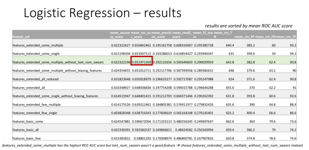
As described earlier, logistic regression will be used with different feature subsets to see which subset leads to the best classifier performance in terms of the ROC AUC score. The parameters for logistic regression used are the liblinear solver and l1 penalty. Below are the resulting scores for each feature set sorted by ROC AUC score. The scores include accuracy, ROC AUC, precision, recall, f1, and contain the terms of a confusion matrix in the order TN, FP, FN, TP where T=true, F=false, P=positive, N=negative. The best feature set by ROC AUC score turned out to be features_extended_some_multiple but one of the included features (text_num_swears) seemed to be overfitting the data so a related feature set features_extended_some_multiple_without_text_num_swears was chosen instead, which doesn’t contain this feature. The same feature set will later be used for all the other classifiers for comparison. Note that for logistic regression, the ROC AUC score turned out to be 65.2% and accuracy 62.2%, so although the classifier is not perfect, it is better than random chance!
For completeness, the chosen feature set features_extended_some_multiple_without_text_num_swears contains the following features (you can check models.py for more information).

Support Vector Machine
The SVM will be tested using grid search (manual looping) through 4 different kernels: linear, polynomial, RBF and sigmoid. For polynomial kernel, the polynomial degrees to be tested will be 2, 3, 4 and 5 (above 5 there’s likely to be overfitting of the model). For each kernel the maximum number of iterations will be looped through {1, 5} * 10^{1 ,2, 3, 4, 5, 6}, i.e. 1, 5, 10, 50, 100, 500, 1000, etc. Finally, for each kernel the C value will be looped through {1, 5} * 10^{-15, -14, …, 14, 15}, i.e. 1e-15, 5e-15, 1e-14, … , 1e15, 5e15. These big ranges of hyperparameters should ensure that most of the reasonable hyperparameter values for the model will be tested, one of which should produce good results.
Because the number of combinations of these parameters is too big and each execution of the SVM train/test procedure takes a long time (especially for very high number of iterations), I had to implement this program using parallel processing (I have used the multiprocessing library in Python), where each train/test procedure for a different set of hyperparameters is submitted to a different CPU core. I have used a cluster at the DSI with 48 CPU cores and the whole script still executed for about 13 hours! It was a great opportunity for me to learn to use parallel processing since I haven’t had access to so much computing power and a good reason to use them before.
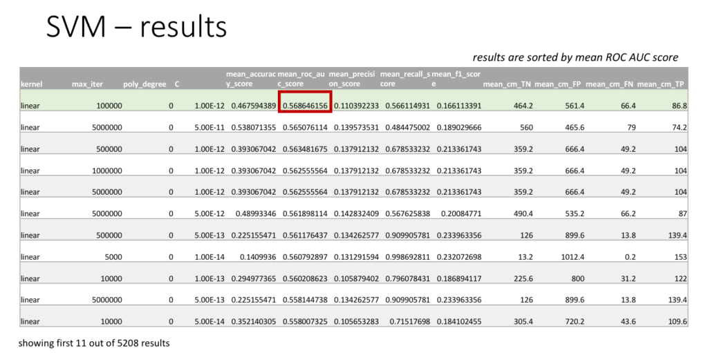
Shown below are the first 11 rows of all the 5208 SVM results, sorted by ROC AUC score. The best set of hyperparameters turns out to be linear kernel, maximum number of iterations = 100000 and C = 1e-12, for which the ROC AUC score is 56.9% and the accuracy is 46.8%. Note that these scores are much lower than the scores for logistic regression. Also, the best SVM results here tend to use linear kernel with C value of around 10^-12, while the maximum number of iterations doesn’t seem to be that important.
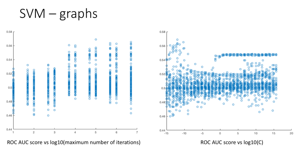
Also, below are some graphs that I have plotted from the ~5000 results. It perhaps seems to suggest that after a certain value of number of iterations (maybe #iter > 1000), the exact value of number of iterations doesn’t matter because the ROC AUC scores tend to be roughly similar. Also from the second graph, the highest values of ROC AUC score seem to be produced for C ≤ 10^-10 but they don’t seem to be very stable.
K Nearest Neighbours
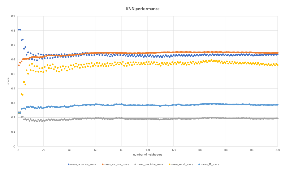
The KNN model was tested by varying k — the number of nearest neighbours used in the model. k was varied from 1 to 200 and the results were noted for each k value. Below are the results, sorted by ROC AUC score as usual.
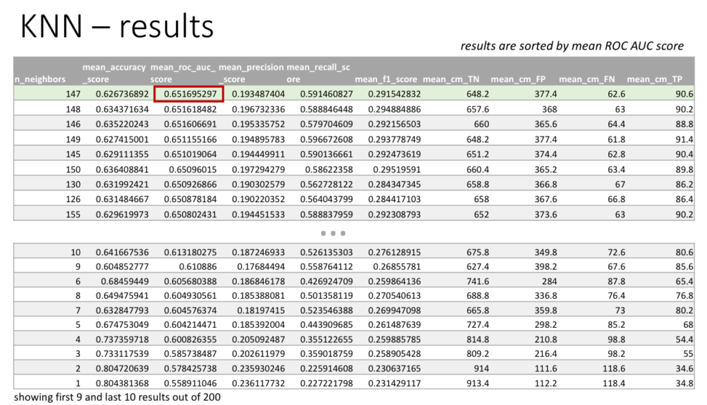
The best number of neighbours to use turned out to be 147 with ROC AUC score of 65.2% and accuracy of 62.7%, which are very similar scores to the ones produced by logistic regression. It seems that slightly varying the k number around 147 produces very similar ROC AUC results. Comparing with the usual choice of k=5, the ROC AUC score is higher by around 5% from 60.4% but the accuracy is lower by around 5% from 67.5%.
An interesting exploration is to plot the scores for different number of neighbours k. This is shown below and it seems that although the ROC AUC scores were highest for k≈150, the scores seem to be pretty much leveled off after somewhere around k≈50.
Random Forest
For random forests, the hyperparameters which were varied are as follows. The number of estimators (trees) used was varied from 1 to 50, the maximum tree depth was varied from 1 to 50 + unlimited, the minimum number of samples required in a leaf was varied from 1 to 25, and the maximum number of features to use when looking for a split was looped through {√(n), log_2(n), 0.5 n, n}. The first few results are shown below.
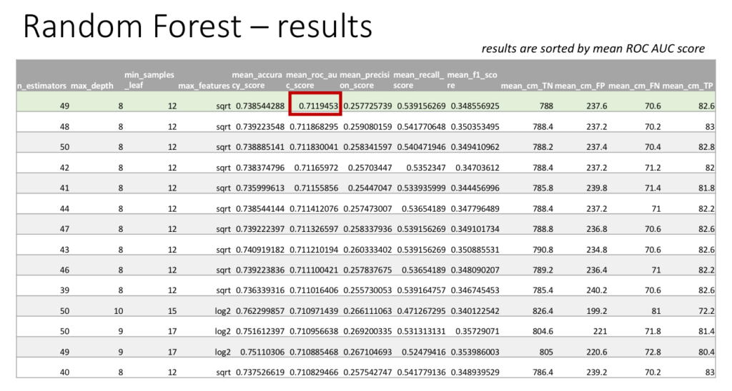
The best set of hyperparameters turned out to be number of estimators = 49, maximum depth = 8, minimum samples in leaf = 12, and maximum number of features = √(n). For this configuration, the ROC AUC score was 71.2% and the accuracy was 73.9%, which are scores that are much higher than for all the other classifiers. An interesting observation is that when the maximum number of features used is log_2(n) instead of √(n), the accuracy score increases by 2.4% to 76.2% while there is only a marginal drop in ROC AUC score by 0.1% to 71.2%, which might perhaps be a preferable tradeoff.
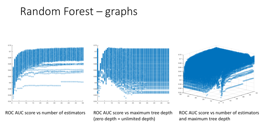
Also, another interesting exploration might be to plot the ROC AUC scores versus different hyperparameters, as shown below. It seems that increasing the number of estimators increases the ROC AUC score before slowly leveling off for higher values of the number of estimators. Also, it seems that increasing the maximum tree depth increases the maximum possible ROC AUC score for that maximum tree depth value. (The third graph combines the previous two into a 3D plot.)
The best model
Comparing the best results (see table below) for logistic regression, SVM, KNN and random forests and sorting them by ROC AUC score, the winning model turns out to be random forests with parameters n=49, depth=8, min_samples_leaf=12, max_features=sqrt. Random forests classifier obtained 71.2% ROC AUC score and 73.9% accuracy score, which is respectively around 6% and 11% higher than the runner-up logistic regression and KNN, and 14% and 27% higher than SVM. And although the classifier is not perfect, a ROC AUC and accuracy scores above 70% seem to be not bad, definitely better than random classification!
What’s next
When I left the DSI, my supervisor told me that he and his colleague will take over my work and after they have finished annotating the complete dataset of tweets, they will rerun the pipelines with the complete data. They will include the results in a research paper submitted to a special issue of a journal (whose name I don’t know), of which I am supposedly going to be the second author (out of 4)! I find it so exciting that I may be able to actually publish something while still an undergraduate — I will keep you posted on how this goes!
This has been a really great opportunity for me, both in terms of learning and using so many new concepts from machine learning, and also in terms of getting a feel for what it’s like to work as a research scientist. I must say I have enjoyed working on the fake news project very much and it made me strongly consider pursuing a PhD in machine learning. Also, I would like to thank Axel and Miguel for their help throughout the project and wish them the best!

Leave a Reply